slide
Articles

Worship Isn’t Boring, So Why Are Your Lyric Slides?

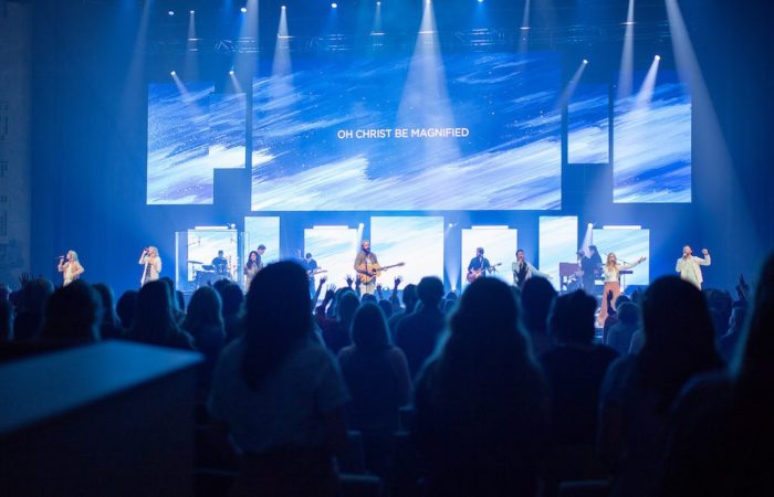
Chris Rouse explains how to spruce up your worship slides:

In my job I see a lot of lyrics slides at a lot of different churches. Some look amazing; some, well, some don’t. I’ve been guilty of making my share of poorly designed lyric slides in the past, but hopefully I’ve moved past that phase in my life.

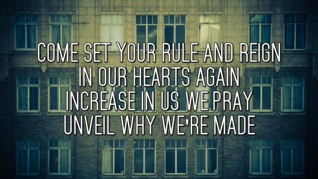
Different backgrounds and fonts can breathe new life into how people experience the songs you’ve sung for weeks. Below are a few examples that are easy to read, but aren’t 75 point white Helvetica with a 3 point black outline and a drop shadow. When I started planning this post, I wasn’t expecting to end up with some many all-caps slides. But with the right font and design, all capital letters can work really well.

Continue reading.

Share this article:
Avatar photo

Don Chapman

Don Chapman‘s passion is for the Church, music and technology, and he blends all three into resource websites devoted to contemporary worship: Hymncharts.com and Worshipflow.com. He’s the editor of the weekly Worshipideas.com newsletter that’s read by over 30,000 worship leaders across the world.

You Might Also Like

Seacoast
Articles

The Next Big Thing Part 2

Last week we talked about the new multi-site church movement that’s happening all over the country, and specifically about Seacoast…

worshipideas:

Essential reading for worship leaders since 2002.


Get the latest worship news, ideas and a list

of the top CCLI songs delivered every Tuesday... for FREE!