Jeff McIntosh introduces the top most used typefaces that churches are using:
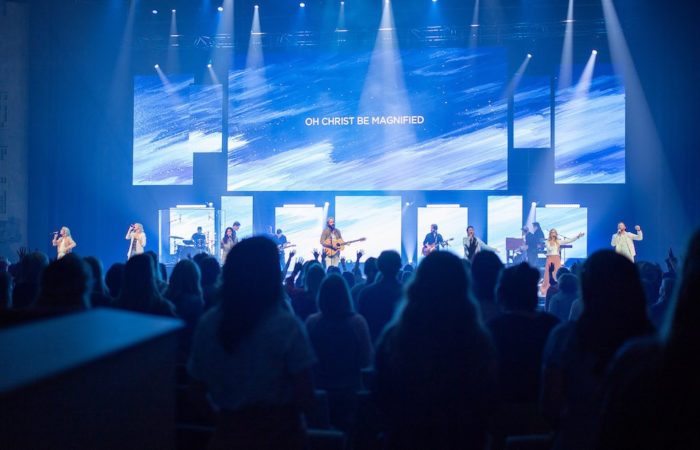
You have many typefaces (fonts) to choose from when projecting lyrics during your church service, youth group or worship concert. I wanted to introduce you to the top most used typefaces that churches are using and give a brief description of their history and key properties. I hope this list will give you a better understanding of these typefaces and will help you make better typeface selections for worship lyric projection in the future. Each example uses the same font size of 27pt for simple visual comparison.
1. Helvetica and Arial
Helvetica is a widely used sans-serif typeface that was published in 1957. It was designed to be a neutral typeface with great clarity, no intrinsic meaning and could be used in a wide variety of signage. Over half a century later it is still a purposeful font that can be found in advertising, street signs and print.