Kenny Lamm addresses font sizes, font types, and line spacing:
Displaying song lyrics in worship with excellence is an often overlooked area of preparation, yet one that can really enhance our worship times. Conversely, poor slide production and operation of the lyric display can greatly hamper worship. (If your church does not use video in worship, start with a previous post, Got Video?)
In the next few weeks, we will look at various components of slide production and operation. These principles will be applicable whether you use PowerPoint or one of the worship presentation software packages such as EasyWorship, MediaShout, ProPresenter, Open LP or SongShow Plus.
This post will address the font size, font type, and line spacing.
Our goal is to make the slide clearly readable by every person from the front row to the back row. Here are some things to keep in mind:
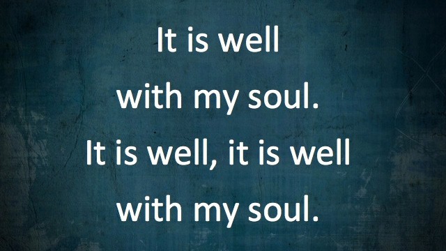
Select a sans-serif font. (that’s a font without “feet”). Some examples are Arial, Calibri, and Verdana. These fonts are easier to read than the serif fonts like Times Roman. Please please please NEVER use Comic Sans!