Let me ask you this. If a stranger visited your church’s website right now, tonight, in their pajamas, scrolling before they ever worked up the courage to walk through your doors, would they know what to expect? Or would they leave more confused than when they arrived?
Up to 80% of first-time guests check your website before they check the parking lot. Before they meet a greeter. Before they hear a single note of worship. Your homepage is the first impression now. Not your lobby and not your stage, your homepage.
And a lot of us built that homepage for the wrong crowd.
The Guest-First Problem Most Churches Don’t See
Most church websites are accidentally built for insiders. People who already know that the Fellowship Hall is the room with the folding tables and the commercial coffee maker. People who already know what a Discipleship Track is and don’t need it explained. People who already know service starts at 10, so nobody bothered to put it front and center.
That’s not a website problem. That’s a blind spot problem.
Worship leaders, you know this conundrum better than most. You spend all week thinking about how to remove barriers between people and God’s presence. The lighting, the song keys, and the flow from one moment to the next. You obsess over whether a transition feels seamless or clunky. But if your website makes a first-time guest work to find your service time, you’ve built a barrier before they even get in the room.
Try this Sunday. Actually, try this before Sunday. Pull up your church’s homepage on your phone and pretend you’ve never been there. Time yourself. Can you find the service time, the address, and a clear next step in under two seconds? If not, you’ve found your first fix.
Speaking Plainly Instead of Speaking Churchy
We love our insider language. Fellowship Hall. Discipleship Track. That one denominational acronym everyone just assumes people understand. But to someone who has never set foot in a church, or hasn’t in years, that language doesn’t sound welcoming. It sounds like a locked door with a secret knock.
Ephesians 4:29 tells us, “Don’t use foul or abusive language. Let everything you say be good and helpful, so that your words be an encouragement to those who hear them.” Now, Christianese isn’t foul language. But it can still fail to be helpful. It can still put distance between our words and someone who is genuinely trying to find their way to Jesus.
So say what you mean. “Kids Ministry, safe and fun for ages 0-5” instead of “Kingdom Kids.” “New here? Here’s what to expect” instead of a maze of dropdown menus. Plain language isn’t dumbing anything down. It’s clearing the path.
The Trust Signals Parents and Guests Actually Look For
Let’s talk about the parents. Because before anyone lifts a hand in worship, they need to know their kid is safe two rooms over.
Parents want to see drop-off procedures, security checks, age divisions, and background-checked volunteers. Spell it out. Don’t make them guess and don’t make them ask a stranger at the door on their first visit, because a nervous parent who can’t relax isn’t going to be present for worship. They’re going to be checking the clock.
This matters for grown-up guests too, honestly. People want to know what they’re walking into. Clear information isn’t a lack of faith in what God will do once they arrive. It’s hospitality. It’s Romans 12:13, “sharing with people who are in need” and “inviting strangers into your home,” except now that home has a homepage too.
Why Mobile Speed and Simplicity Change Everything
Over 60% of your traffic is coming from a phone, probably held by someone standing in a parking lot or scrolling in bed at midnight wondering if this is the week they finally go back to church. If your site is slow to load, or the menu breaks, or a pop-up ambushes them before they can read a word, they’re gone. They won’t try twice.
What most churches try is adding more. More graphics, more carousels, more auto-playing video, more ministries listed in the navigation bar. And that’s exactly why it fails. Hick’s Law says the more choices you throw at someone, the longer it takes them to decide anything, and a confused visitor doesn’t decide to come. They just close the tab.
So simplify. Four to six items in your main menu. Everything else can live quietly in the footer. Compress your images. Test your site on an actual phone, not just a laptop. Aim for load times under two seconds, because a slow site says neglect even when your heart says the opposite.
Sermon Archives and Livestream Quality Reflect Your Worship Values
If your church streams services or posts sermon audio, listen up. Treat that content with the same intention you’d treat a Sunday set list.
Guests should be able to find a past message in three clicks or less, searchable by topic or series. And your livestream needs to actually stream. No dead air, no buffering during the bridge of your favorite song, no copyright strikes because someone forgot to square away CCLI licensing. That stream might be the only “church” some people experience for months. Make it worth staying for.
Real Photos Build Real Trust
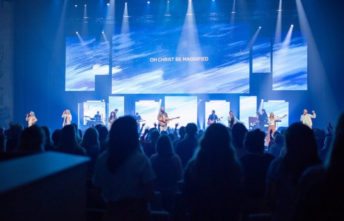
One last thing. Ditch the stock photos of impossibly diverse strangers laughing at salad. Use real photos of your real congregation, your real stage, your real people. Let guests see what they’re actually walking into, dress code included, because nothing erodes trust faster than a website that promises one thing and a lobby that delivers another.
Let your website give people an honest, accurate view before they ever walk through the door. Not a filtered one.
Your website isn’t just marketing. It’s often the very first act of hospitality your church offers someone who is searching, scared, or simply curious. Treat it with the same care you’d give a guest standing in your foyer. Clear it out, clean it up, and let it point people gently toward the God who’s already waiting for them, because that is a good gift.