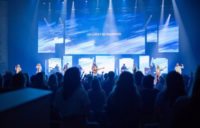

Has this ever happened to you? The band is locked in, the room is ready, and then the people in the back squint up at the screen with tilted heads and start silently trying to read instead of singing because the slides cannot be decoded.
Bad slides do not announce themselves. They just quietly steal the room.
The Invisible Thing That Shapes Every Service
The honest truth is that when your media is working beautifully, nobody notices it. Not a single person walks out and says, “Wow, those line breaks were perfectly phrased.” But when it is not working, everyone feels it, even if they cannot name it. The text is too small. The background is fighting the words. The next line is not up yet, and now half the room is half a beat behind while the other half has just given up and is watching instead of worshipping.
That friction is not neutral. It costs something real. As worship leaders, we talk a lot about creating space for people to encounter God. We talk about song selection, set flow, and band dynamics. But the slides are part of that environment too. They are just as much your responsibility as the key you chose for the bridge.
The person running your screens is, in a very real sense, leading worship. They just do not have a musical instrument in their hands.
The Default Settings Trap
Most churches get their media system set up once and then just keep using it. A volunteer learns the software, builds a template, and that template gets copied forward indefinitely. Nobody is being negligent. Everyone is just busy, and the result is a slow drift toward slides that technically work but do not actually serve the room.
The other common approach is to make slides look impressive. Big dramatic backgrounds. Lots of movement. Interesting fonts. Something that feels professional and produced. Which sounds right. But here is what actually happens. When the background is too busy, the eye has to work twice as hard to find the text. When the font is stylized and thin, it dissolves over motion. When there is too much text crammed onto one slide, the font gets smaller and suddenly the back row cannot read it at all. The production value goes up and the participation goes down.
We end up with slides that look like they belong in a promo video but function poorly in a live worship environment. And those are two completely different things.
What Good Slides Actually Do
Good slides get out of the way. That is the whole job.
Clean, legible fonts, preferably sans serif. White text as the default, with a soft shadow behind it if the background is light or visually complex. Two to four lines per slide, maximum, with generous empty space around the text so the eye can rest. Font sizes large enough for the furthest row in your room, and consistent from slide to slide so the text is not jumping around as the song moves forward.
Line breaks matter more than most people realize. The computer will wrap text however it wants to if you let it. Do not let it. Break lines the way the song actually behaves, at natural musical or lyrical phrases. “Holy Spirit, You are welcome here” should never be split so that “You are” lands by itself on the second line. That is not how anyone sings it or hears it.
And the background should match the moment. A high-energy anthem needs different visual pacing than a quiet song of response. When you hit an instrumental interlude or a spontaneous moment, a blank slide is not laziness. It is a gift to the room. It quietly says, “Just be here. Nothing to read. Nothing to track.”
The Half-Second That Changes Everything
Slide timing is its own skill, and it is one of the most underrated jobs in the room. The goal is to get the next line on screen just before the congregation needs it, roughly half a beat before the last syllable of the current line lands. That gives people enough time to read ahead so they can confidently sing the next phrase.
When slides are late, people stop singing and start waiting. When they are too early, people lose their place and begin second-guessing where they are in the song. That half-beat window is the sweet spot, and it takes a prepared, attentive operator to hit it consistently.
This means your media operator needs to know the songs. They should have listened to the set before Sunday. They need clearly labeled, consistently formatted song files that make it easy to jump when the worship leader unexpectedly repeats the chorus. Standardize your labels: Verse 1, Chorus, Bridge, Tag. Keep spelling, punctuation, and capitalization consistent across your database. If you omit periods at the end of lyric lines, omit them everywhere. The little inconsistencies add up to a presentation that quietly feels unfinished.
Try This Sunday
Before the service starts, walk the room. Not from the stage. From the back row. From the sides. From the seat with the worst sightline in the building.
Pull up your slides and look at them through the eyes of a first-time guest. Can you read them instantly? Is the contrast strong enough? Are any lines wrapping awkwardly? Is the background competing with the lyrics instead of supporting them?
Fix what you find. Then do it again next week until it becomes part of your normal preparation.
And do one more thing. Thank your media operator.
Your media operator is leading worship too. Prepare them. Resource them. Include them in rehearsals whenever possible. Help them understand that what they are doing is far more than advancing slides. They are removing obstacles so people can focus on Christ instead of squinting at a screen.
When the slides function well, nobody thinks about them because they simply work. People stop decoding and start singing. They stop watching and start worshipping.
And creating that kind of atmosphere for people? That is a very good gift.